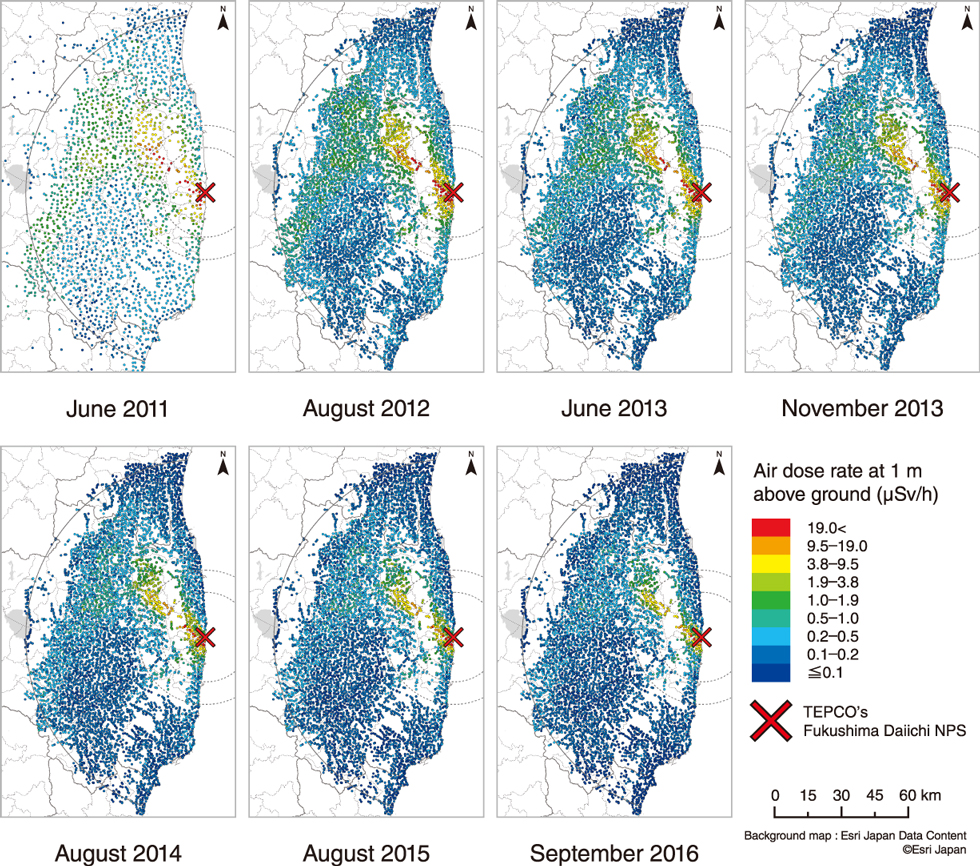
Fig.1-34 Air dose rate distribution maps based on the fixed-point survey since 2011 (including contribution of natural radiation)
The areas with relatively high dose rates indicated by red, yellow and green, have been shrinking gradually.
Go back by your web browser, or click the right button.« Close